http://news.yahoo.com/s/yblog_thelookout/20110223/ts_yblog_thelookout/separate-but-unequal-charts-show-growing-rich-poor-gapSeparate but unequal: Charts show growing rich-poor gapBy Zachary Roth
Yahoo! News
Feb. 23, 2011
The Great Recession and the slump that followed have triggered a jobs crisis that's been
making headlines since before President Obama was in office, and that will likely be with us for years. But the American economy is also plagued by a less-noted, but just as serious, problem: Simply put, over the last 30 years, the gap between rich and poor has widened into a chasm.
Gradual developments like this don't typically lend themselves to news coverage. But Mother Jones magazine has crunched the data on inequality, and put together a
group of stunning new charts. Taken together, they offer a dramatic visual illustration of who's doing well and who's doing badly in modern America.
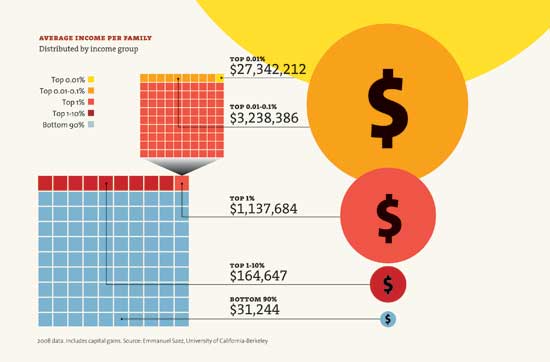
Here are three samples:
This chart shows that the poorest 90 percent of Americans make an average of $31,244 a year, while the top 1 percent make over $1.1 million:
[
Continued...]